Ahhh busy busy. I’ve spent several days condensing a number of longer poems down to something resembling a haiku or senryu. Let them all percolate for another couple of days, then sat down to start painting today. (well, yesterday now) I chose two that brought to mind a clear visual image that was linked to the content without just directly illustrating it. I feel the art aspect of the haiga should add something more to the poem. It is a tricky balance though, a direct illustration can help make the poem’s meaning more clear… I worked fairly quickly in that I didn’t let myself over think the topic too much or I knew I would buckle to nerves and not be able to make anything. It was a glorious day, I threw wide all the windows and just basked in the sunshine. First day I’ve sat in my studio to make art barefoot and in a t-shirt! Very bohemian, I like it. Might even find a nook to put the little heater away instead of falling over it all the time.
So, here they are, my very first ever haiga: After the storm
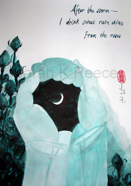
This is all ink painting with a single watercolour brush. The hands are mine, but upsized – they wanted the art in A3 size. This is my favourite colour for inks at the moment, it’s Air Corp Blue Black, which is one of Noodler’s inks. It dries water fast so you have to work very quickly because once a layer dries you cannot blend it. It’s rather unforgiving! But I just love the shades you get from it, I have my ink pots lined up, 6 of them from almost completely water through to almost completely ink and I often load my brush with more than one at a time to get that lovely gradient of colour in a single brush stroke.
And the second haiga: Warm summer night:
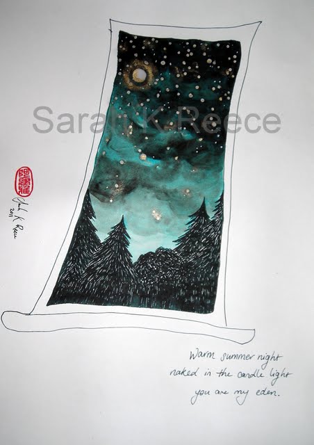
This is done with both brush and pen – Noodler’s ink is designed for use in a fountain pen, as you can see it writes very dark, almost but not quite black. I had a lot of fun with this painting, the window and trees are all pen, and then I decided to use a wax resist for the stars in the sky. I dotted candle wax all through the sky – more where it is darker, added a moon, then painted the sky in ink. I ironed off the wax into hand towels afterwards, and added the gold ink. I particularly love the halo around the moon. I also like the contrast with the poem – the image feels quite ‘cold’ for a warm summer night – although I was thinking very late at night, after midnight. I also like that I’ve shown what the lovers would see rather than painting them, it connects with the direct ‘you’ in the poem – we are in that place, not observing someone else in it.
One of the things I really like about haiku and senryu is their immediacy. You can’t write them without practising mindfullness, being entirely in the present moment. So both images put the viewer into the situation described – looking down at hands full of rainwater, or out of the window at night. I don’t think I’ve tried that approach before, of putting the viewer into the work; it quite tickles me.
I’m also thrilled to have the chance to appropriately use my new Chinese seal from Singapore. I chose the Chinese name 阿丽雅 (Aaliyah) because it has the same meaning as my English name – Princess. The red seal is so strong and striking. When I first saw it used on work, I used to feel it was unbalanced and harsh. But now it’s grown on me, there’s a lovely contrast between the red and the blue black. It’s always a difficult decision about where to place it, traditionally it is not hidden away like a signature generally is at the bottom of a painting. I’ve placed it quite prominently in both of these, but added my signature and the date, considering that my audience is likely to be predominantly English and may not be familiar with the use of a seal.
And emailing it all off! Always a nerve wracking process. I checked everything five or six times, re read all the instructions several times over very carefully – it’s depressing how often I discover some important thing I’ve missed doing this. The specifications are for the images to be suitable to be reproduced at A3 size – which gives me some trouble as if it was A4 or smaller, I’d just print and check! I did some net trawling looking for advice about pixels and dpi and generally became more and more confused about it all and seriously worried that my photos weren’t up to standard. Then I finally found a photo print shop which kindly had the general specs listed. According to them, I’m okay! As I don’t have any way of taking any higher resolution images, I’m choosing to believe that and have sent everything off. Several days early too, I think that has to be a first!